A clear and easy-to-understand representation of data supports communication effectively with our audiences. Visualize information, facts, and interdependencies clearly through color and layout.
Guidelines
- Use cranberry and turmeric predominantly. Add opacity when there are several data points to compare within the same graph.
- Use Myriad Pro for data figures.
- Bar weight and fill area of a donut chart should be substantive and easy to read.
- Add data labels, legends, and text boxes that point out what each ring of a doughnut chart represents to convey what data is plotted in the chart.
- You can use Excel or PowerPoint to replicate the charts and graphs below.
Bar Chart
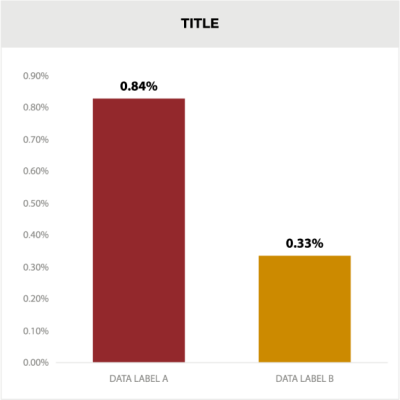
To compare two contrasting points, use cranberry1 and turmeric3.
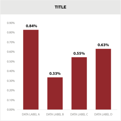
To display various data points on the same topic, use all cranberry1.
Donut/Pie Graph
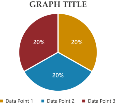
To show 3 - 4 topics, use a donut chart with cranberry1 and light cranberry2 for the 1st two points. Use turmeric3 and light turmeric4 for points 3 and 4.

To convey data around multiple topics, use gradients of cranberry1 and turmeric3.
Line Chart
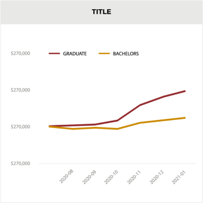
To compare to contrasting points, use cranberry1 and turmeric3.
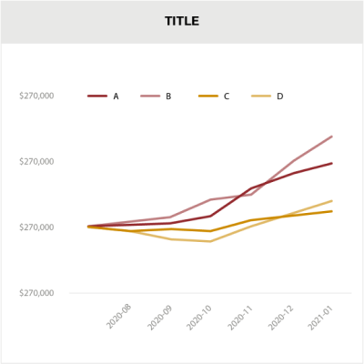
To compare 3 - 4 distinct points, use cranberry1 and light cranberry2 for the 1st two points. Use turmeric3 and
light turmeric4 for points 3 and 4.
light turmeric4 for points 3 and 4.