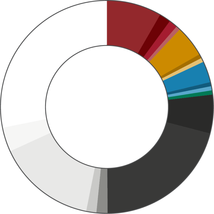
Consistency in color is how we command respect for our brand. Think of brands that have been around for decades. They do not deviate from their color. They do not deviate from their colors because to do so would decrease brand recognition. Beginning in 2022, Bastyr University's colors are as follows:
Secondary Color
Turmeric is complementary to the primary color and works to add warmth to the university’s design system. It is never used without the cranberry and is never used for text when the background is white. Turmeric can be used for text when the background is cranberry.
Tertiary Color
Warm Neutral Colors
Neutral colors are used for supporting elements or text. They act as a base and allow the primary, secondary, tertiary, and accent colors to take the spotlight.
Accents Colors
These colors are to be used with the expressed permission of Marketing only. Please email [email protected] with an explanation of your use.
Color Proportions
The color proportions chart demonstrates how much of each color should be used in relation to one another. The primary color is the most prominent non-neutral color, with the secondary and tertiary colors following in scale. For web applications, neutrals and white play a significant role in offering support and balance.
White space is important to our brand. Refrain from having more cranberry in your design than white.
